Data visualizations - 2022 Challenges
In 2022, I set a goal to do more projects. Here are the dataviz I submitted to online challenges.
1) Friends series challenge (January)
-
Question: Can you identify what makes a great Friends episode?
-
Data is from Kaggle (extracted from IMDB)
-
Selected in the top 5 runners-up amongst 206 participants by guest judge Bill Shander for the Onyx Data Challenge.
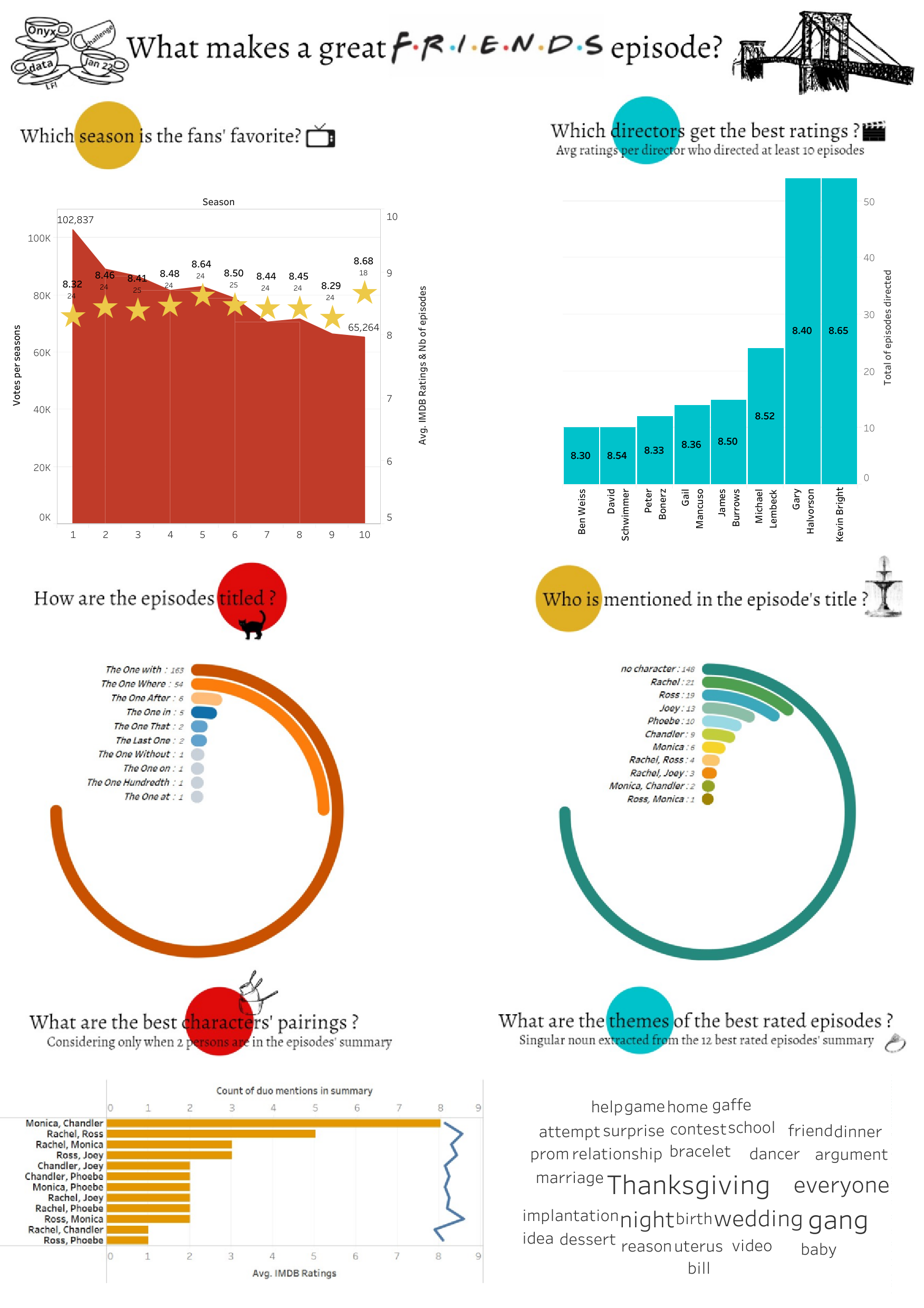
I learned new things for that challenge : how to do a radial chart, how to mirror a bar chart (so that it is aligned on the right side, instead of the left side (it’s done by using dual axis) and how to make a word cloud in Tableau.
2) Super bowl commercial challenge (February)
-
Challenge: Recommend a data-driven strategy by analysing historical data (Super bowl half-time commercials 2000-2021) to guide the creative direction for their making of a Maven Motors Super Bowl spot.
-
Data is from Kaggle
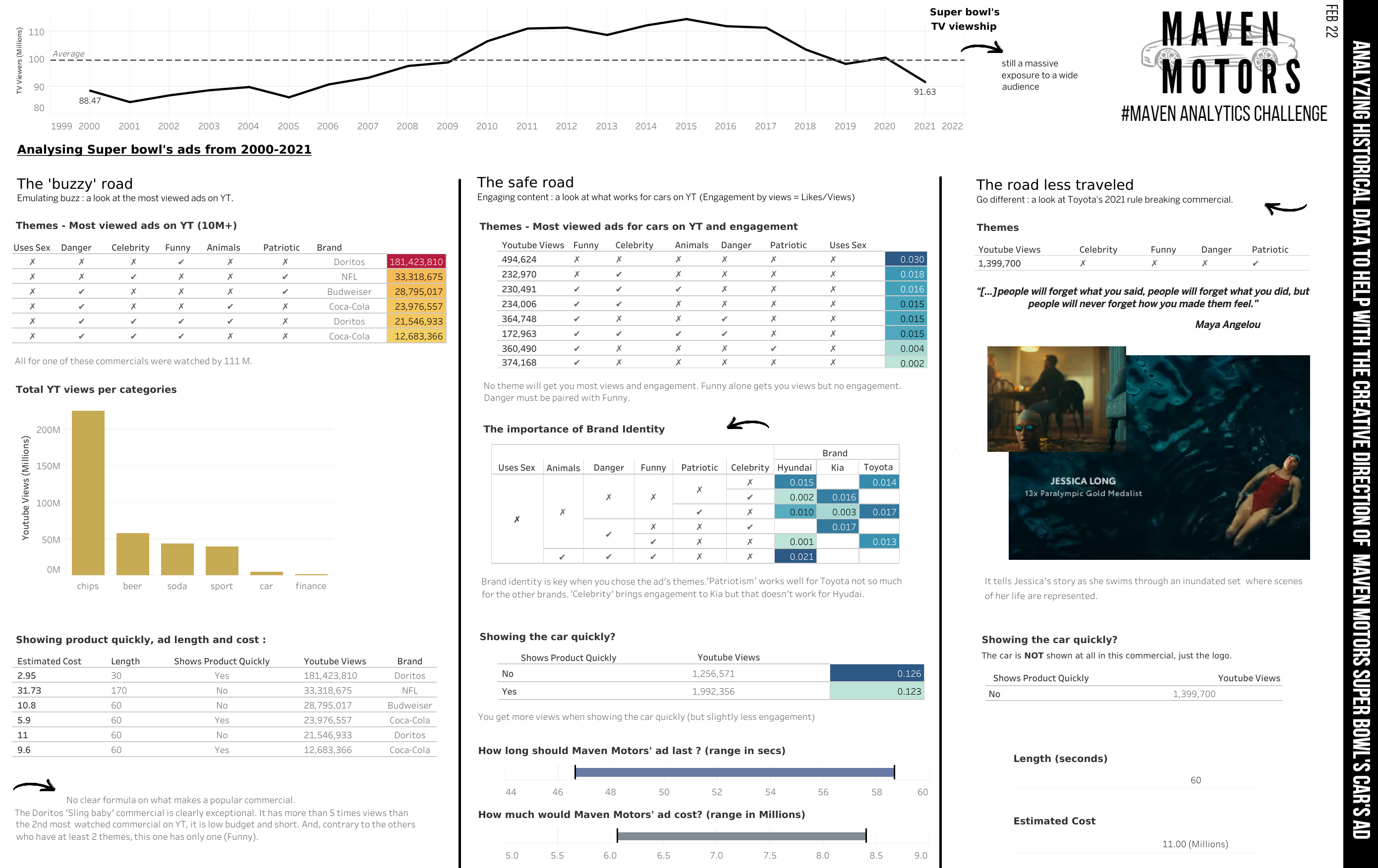
Nota: YT = YouTube. I based the analysis on the YouTube views from the dataset since people were first exposed to the commercial on TV and then went on to search for it on Youtube. It is important to take into account that there is no proper official YT channel for those ads; so those numbers are more an indication than anything.
Since the dataviz was more aimed at the creative team, I choose simpler graphs and made it look a bit more like a mood board. It is divided in 3 panels that brings elements of answers to guide the creative team. The “buzzy road” looks at ads that generated the most views on YouTube. There is no clear pattern on what generates buzz. The “safe road” focus on the car ads in the dataset. The “road less traveled” takes a closer look at the most viewed car ad from the dataset.
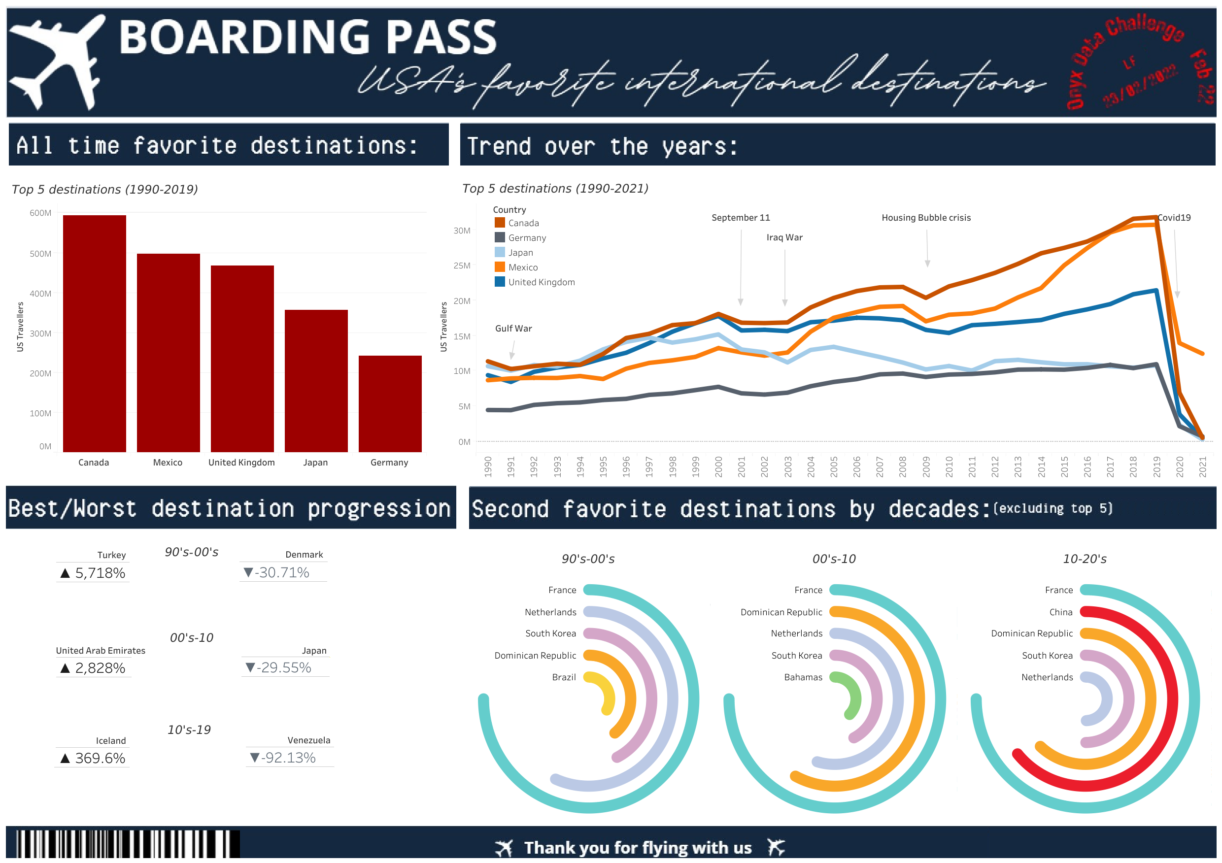
3) USA’s international travels challenge (February)
- Challenge: Can you identify USA’s favorite travel destination?
4) Fictional Pie Bakery challenge (March)
- Challenge: Can you help this fictional bakery to improve their business by gathering insights from the last two years of pie sales?
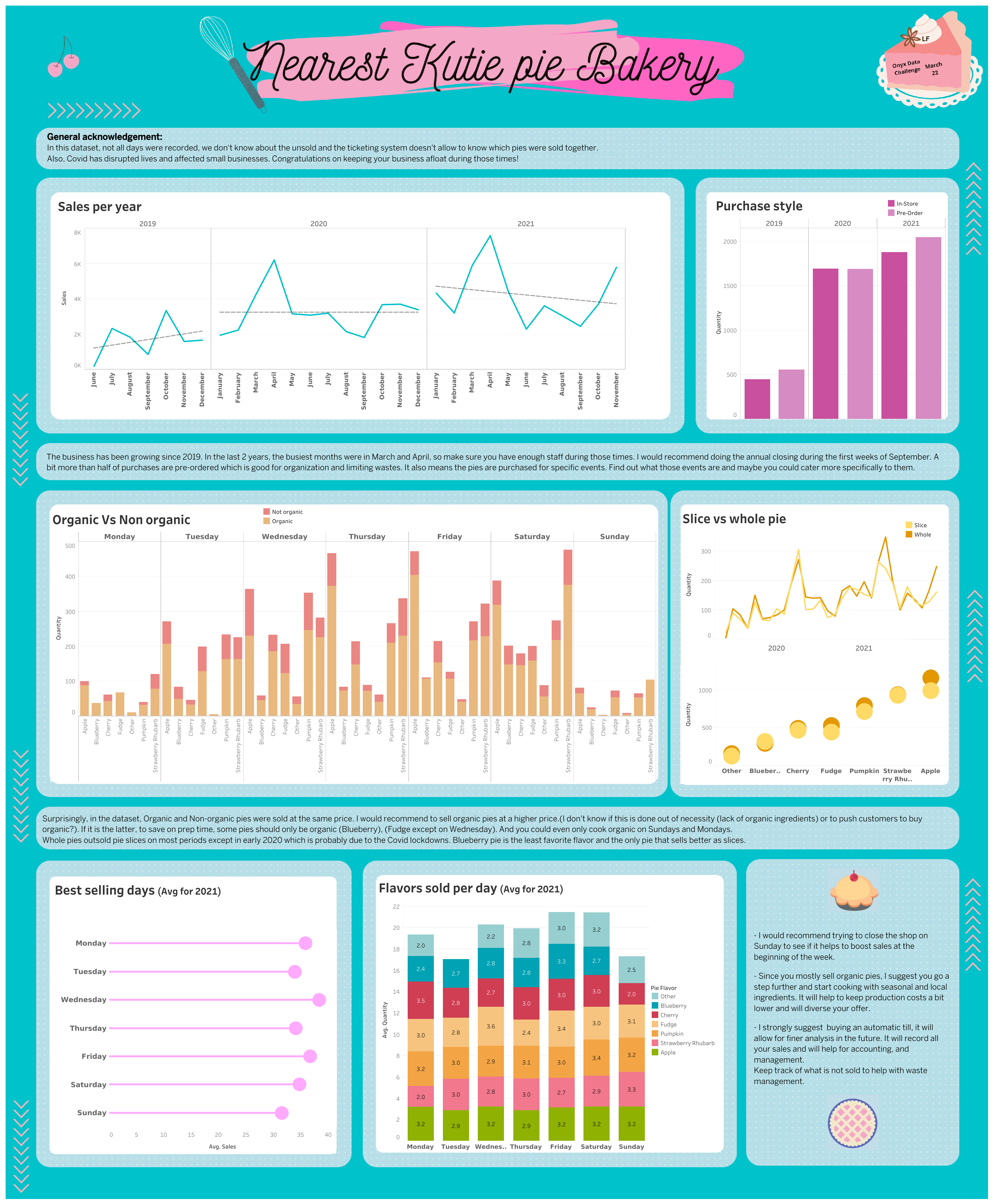 For this challenge, I wanted a neat, coherent and pretty board, so I learned to use Figma.
5) Remote Work challenge (March)
- Challenge: Assess the productivity and morale implications of working remotely and outline an ideal policy for the post-pandemic future.
Dataset : Survey results of 1,500 remote workers from the Australian state of New South Wales, taken in August-September 2020 and March-April 2021, which aimed to capture the shift in remote work experiences and attitudes during different stages of the COVID-19 pandemic.
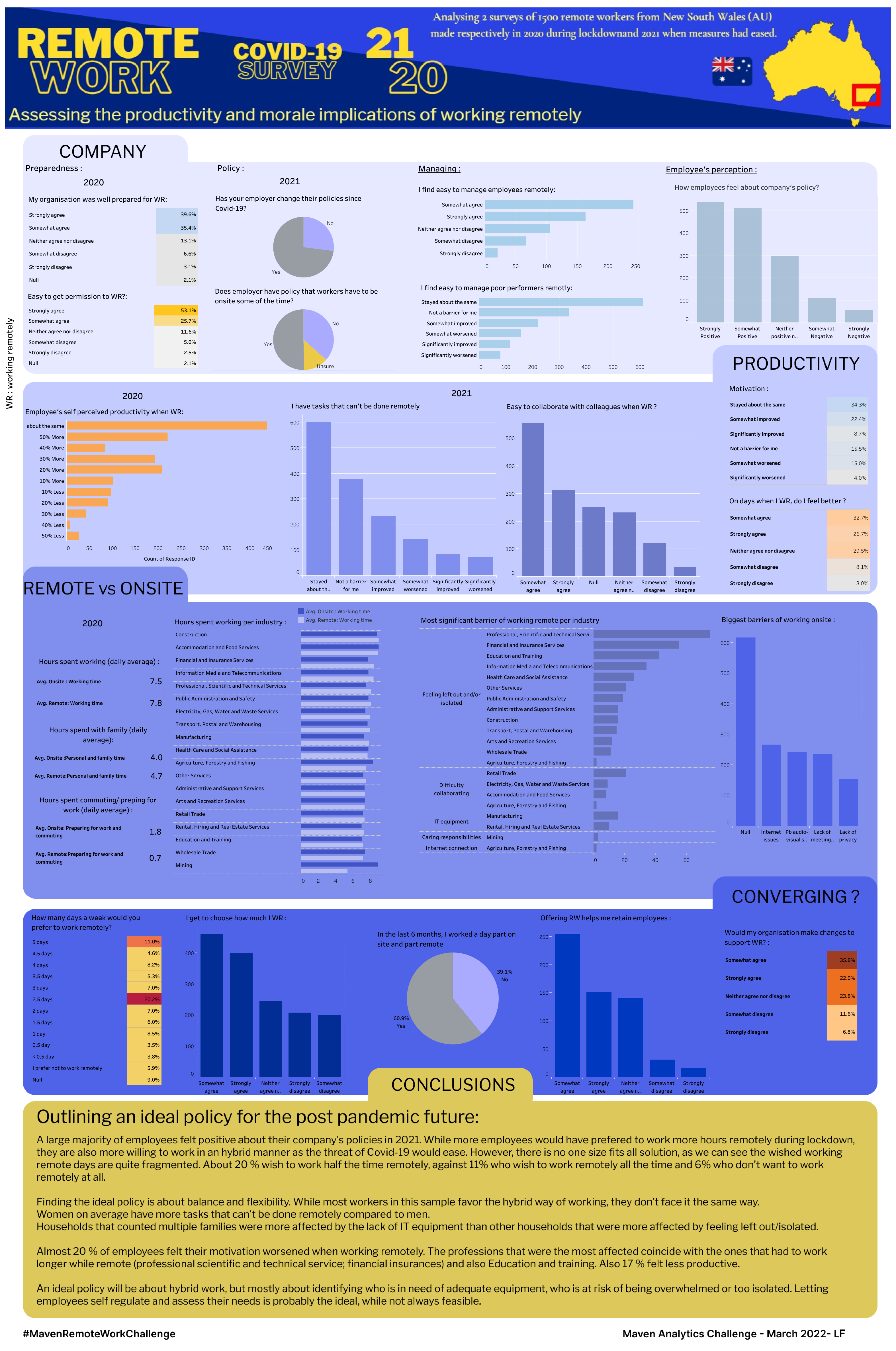 My second project using Figma.
This one that particularly challenging as there were more than 200 columns to analyze and rename.
I choose to break down the analysis in 4 panels (Company : to see how the company had handled remote work ; Productivity : to see how workers managed remote work; Remote vs Onsite : to see impact and differences in remote and onsite work ; and Converging? : to have an overview of employees' wishes and companies' actions.
The 5th panels is my conclusion for an ideal policy for the “post-pandemic future”.
I managed to finish the challenge on time, but I think this dataviz would benefit from a little bit of rework.
My second project using Figma.
This one that particularly challenging as there were more than 200 columns to analyze and rename.
I choose to break down the analysis in 4 panels (Company : to see how the company had handled remote work ; Productivity : to see how workers managed remote work; Remote vs Onsite : to see impact and differences in remote and onsite work ; and Converging? : to have an overview of employees' wishes and companies' actions.
The 5th panels is my conclusion for an ideal policy for the “post-pandemic future”.
I managed to finish the challenge on time, but I think this dataviz would benefit from a little bit of rework.
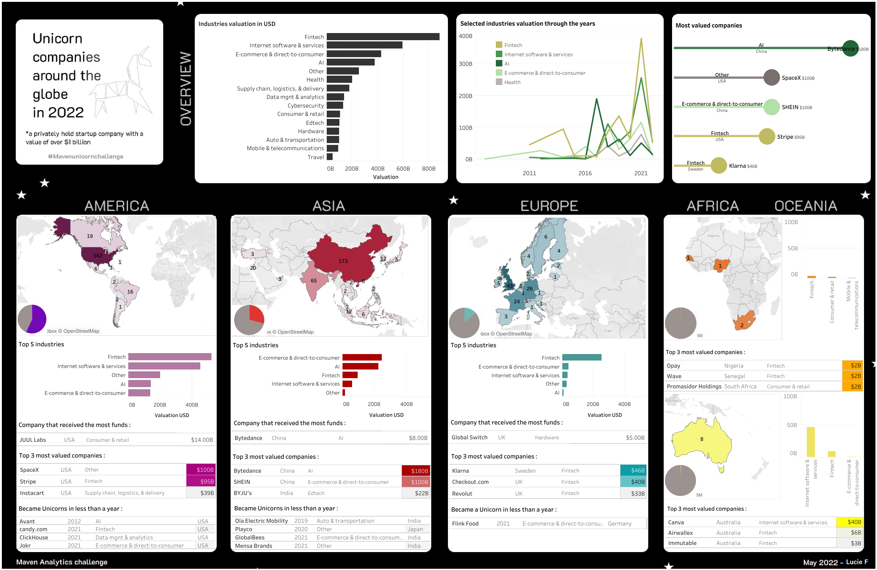
6) Unicorn companies around the globe in 2022 (May)
- Challenge: Illustrate the current landscape of Unicorn companies around the globe
Dataset : csv table with 1074 records
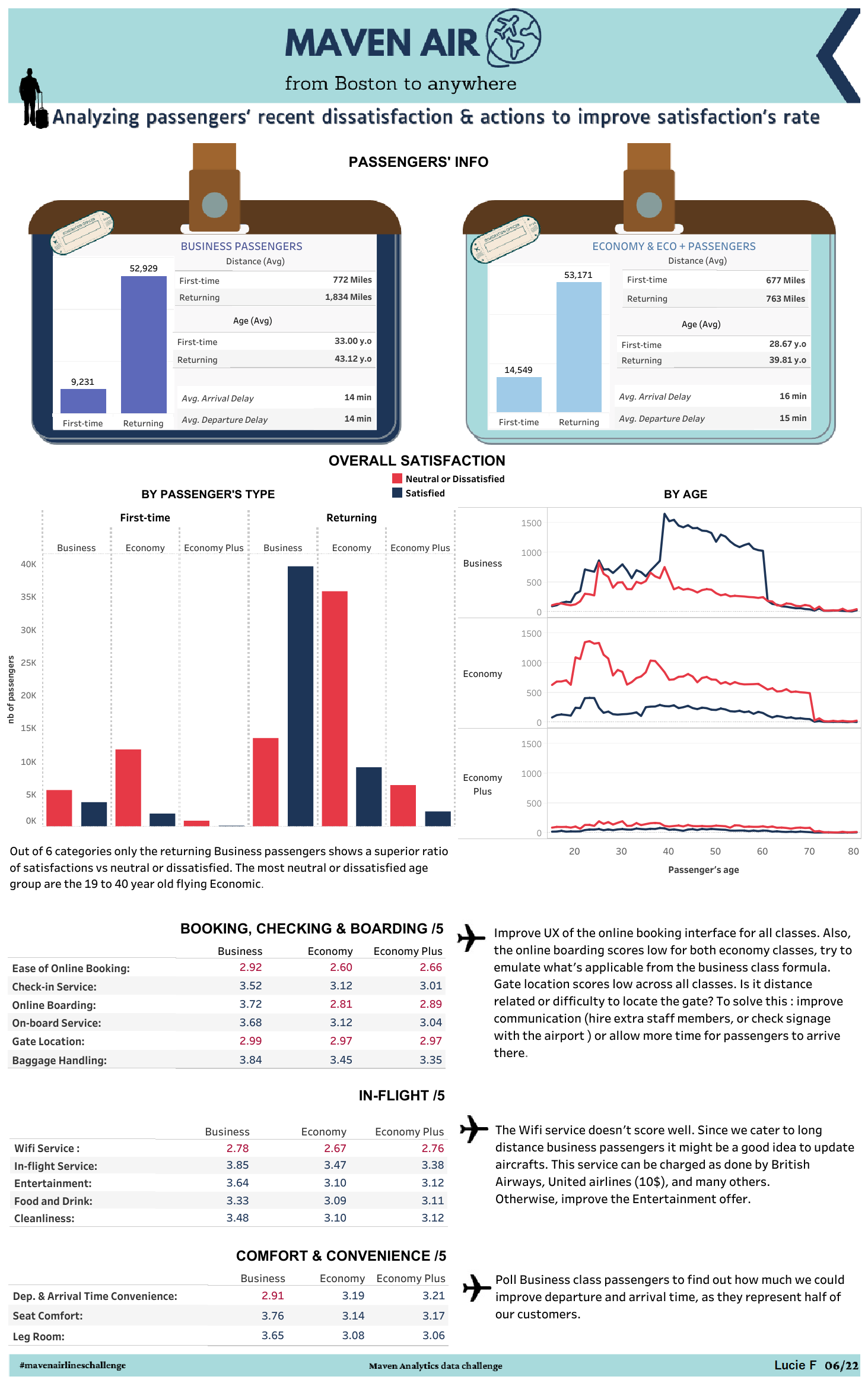
7) Airline customers' satisfaction (june)
- Challenge: Recommend a data-driven strategy for increasing this airline’s satisfaction rate.
Dataset : csv table with 129880 records of a fictional airline company from Kaggle